| Entrance | Mainstreet | Wiki | Register |
|
# of watchers: 11
|
Fans: 0
| D20: 13 |
| Wiki-page rating |  Stumble! Stumble! |
| Informative: | 0 |
| Artistic: | 0 |
| Funny-rating: | 0 |
| Friendly: | 0 |
Previous:  | Up: gallery 1675 | Next:  |

2010-04-02 [NOOOPE]: Before I give a legit comment, could you make it like... img500: or something so I can click it and expand it in a new window? Right now it's too long and the side bar is cutting off a lot of it.
2010-04-02 [Aeolynn]: done!
2010-04-02 [NOOOPE]: Since you're new to PS, here's some cool ass shit to look at:
http://shadowu
http://novawuf
Though, these are for like... super realistic drawings and yours seem more along the lines of lion king.
Something like this might help you get more ideas:
http://makani.
http://makani.
http://makani.
Just how the fur is suggested but it's very subtle. It isn't extremely streaky, just in some select areas. Also, I love how this artist uses tones in her animals and gives them huge personalities.
I really like the energy in the poses you gave the animals. They really do look like they're in motion. I would, however, be careful about anatomy. Their bodies look like they could move and be real but they don't look like lion or wolf bodies. They look like the dragons you draw, which are awesomely shaped, but these aren't dragons.
Here's another artist you can look at in regards to animals. She's rockin' ->http://sandora
2010-04-02 [Aeolynn]: I actually know that last artist! Well, I know her work XD thanks M.
Though, I don't think I'm really up to that realistic skill level, I'm definitely saving all those for refs :]
2010-04-03 [Chel.]: I'm not sure if it's part of your style or not, but I think their mid sections are a bit too long and ferret-like.
A lion's build is a bit more "stocky" Like this:  There is actually no (or a very little) arch up in the underbelly.
Same goes for a wolf. Also, if you wanted to be more anatomically correct, a lion significantly larger then a wolf.
As far as rendering goes, this is actually quite good for an early photoshop work. Mine were gawd awful in the beginning! My suggestion would be to try manipulating the brushes you are using in the brushes panel. Make sure "shape dynamics" is checked on. This allows line to fade in and out according to one's pen pressure. I didn't learn this til recently and it's AWESOME.
2010-04-03 [Aeolynn]: Yeah I can see that, about the bodies... and I think it is my style. XD and about their sizes, they're about the same height, so their fursonnas' are the same size basically.
2010-04-03 [Chel.]: Yea, I wasn't totally sure, so I just said what I did. :P Heh.
2010-04-04 [NOOOPE]: Ooo! Aeolynn, this is super cool! I like the parchment paper. I also like the directional line and the value shifts. The only think I think could be changed is make making the lines less black. If it's a little more brown, it'll look faded and fit on the parchment better.
2010-04-04 [Chel.]: OOOooOOoo yea! I agree with M. Or you could put the lines on a multiply layer in photoshop and that texture could really come through. If you don't know how, I can help.
Otherwise, yea, this is really awesome.
2010-04-04 [Aeolynn]: Sorta like this?
2010-04-04 [NOOOPE]: Yes! Very cool.
2010-04-04 [Daisy_Sandybanks]: I like it so far.
I feel like the back leg and tail should be faded a bit more though. That way you'd get a good sense of depth and perspective.
2010-04-04 [Aeolynn]: It's a cape XD
2010-04-04 [Daisy_Sandybanks]: Hah, whoops.
Ok, well fade the cape a bit then?
Or make it look more like a cape? :/
2010-04-09 [Teufelsweib]: even though I'm not into WOW, I really like the look of this :D
2010-04-19 [Keylla]: It's good, a bit more shading with the armor, or something, because for me it kind of all blends detail-wise together, unless it's supposed to be like that, over all though, i like it :D
2010-04-26 [pegasus1000]: First thought Ugh WOW… Then I put my bias aside to the actual artwork. And said “Cool”
-I agree with [Keylla] It would be nice to see this done with better shading. (or with more then one technique.
-(I hope this doesn’t sound rude) Did you only use one pencil? (If yes)When you only use one pencil you are limited in your shading and I hope that if (When) you continue to work in this line of drawing you will consider your tools.
- You really did do a good job on the definition in the arms and head. You have a lot of potential for this piece. I like the stance your character is in. It is a hard one to draw without something to model after. Keep working on it.
2010-04-27 [Aeolynn]: 1. this is a digital drawing, so only one 'pencil' used
2. this was a 4 dollar commission, spending more time on it would be even more of a steal then it is
3. pose is EPIC.
:D
2010-04-28 [pegasus1000]: It's good to hear someone is getting good money out of their work. (any money is good money.) I am more impressed knowing it's digital.
2010-05-17 [arthemis_]: He is creepy! It's really cool that you made it with a tablet! It's something I for one should have more practice at! Absolutely neat sketch, perfect digital finishing it to make it a work of art.
2010-05-20 [The Dizzy Raven]: I love the shading :) Very awesome, Aeolynn!!!! :D Great job!!
2010-05-20 [Falx]: Wow. I would have guessed pencil. It's an awesome digital and the pose IS epic. Trolls actually do stand like that sometimes. It's kind of cool to see some gaming art up. I don't get to see it around here very often. Anyway, excellent job!
2010-05-21 [Aeolynn]: Thanks for all the comments XD new one up now!
2010-05-21 [The Dizzy Raven]: That's pretty!!!! I love th eocean scene! :D
2010-05-21 [Falx]: I like the ocean and the beach as well. In particular, how the water and the horizon meet blur into one another like they would in real life. This might just be a personal thing, but the tail seems a bit stiff. I feel like it should be streaming more. I like the attention to detail: the freckles on her skin and the dapples on the coat.
2010-05-21 [arthemis_]: In my opinion anatomy is near perfect! Really cool scene, love the pose. Horses are particularly difficult to draw, at least I always end up with dog/cow like figures. Did you use reference?
2010-05-21 [Aeolynn]: Yeah, the reference is linked. My style I've come to notice is very curved, "ferret" like as chel/m have said XD... and yeah, I'm probably going to rework the tail soon... next week!
2010-05-22 [Chel.]: I suppose my crit would be that I think the background around the figure should be tighter. The blur in the WAY back is fine but having that everywhere makes it flat.
2010-05-22 [Daisy_Sandybanks]: I like it, the pose is very expressive. :)
I agree with [Chel.] though, the background does seem a bit flat and uninteresting. I know it's a beach, but try adding some small crashing waves, or seashells along the shore. Just something to livin it up a bit. :)
2010-05-22 [pegasus1000]: I like this pic it is nice to look at, an artistic pose. I am weary that it is not a practical pose. If she were running down the beach her upper torso would go with her strides. Think of if she were human what would her body look like as she runs, or even think of a horses neck and head as they run. However if she were starting to rear up then it would be fine. I just can’t tell what the actual movement is. (Such is the life in still frames)
2010-05-22 [Aeolynn]: think of a flirting filly, they throw their necks up and slightly back, which is what I tried to show here... and the BG was rushed, im not good at BG's... this was for a contest that ended yesterday so... yeah. Will add more later.
2010-06-12 [Chel.]: I approve of this one. The ominous, owl-like face really sparks a lot of interest. The feathers and rendering look wonderful too! Something I would recommend is making the black lines into a navy. I think the creature would have more flow that way. :3
2010-06-12 [Aeolynn]: I can do that when I get back! This was really just a test, and I'm glad it turned out well
2010-06-12 [Yncke]: That looks fantastic! I love the design of the creature, and the way you really have the feeling he's making an air manoeuvre.
2010-06-12 [Aeolynn]: I actually need to fix his back wing, but thanks! I've fallen in love with his design as I was drawing it, and he's an official original species of mine now :3
2010-06-12 [Teufelsweib]: at first I thought it's head was chopped off or something x) but it's an owl face, right?
it looks awesome :D I wish I could draw wings that good <3
2010-06-12 [arthemis_]: It's indeed an owl face, Barn Owl if I'm correct. The wings are fantastic, the idea is fantastic. I'm in love with this creature, though my first impression was: weird, I quite love it on a second look.
2010-06-12 [Aeolynn]: It is supposed to look like a barn owl face, but in fact it is a mask. He is a spirit of either water or air, and the spirits take on any form that pleases them, and they all have in common this mask like face, with no mouth.
The lines that look like a beak are just the middle of the mask
2010-06-13 [pegasus1000]: Before You said that the face was a mask I was thinking "Owl meets dragon" for the design. Now I am just wondering what it's face truely looks like. Great job on the design. You should chose if it is a water or air spirit it would add character.
2010-06-13 [Daisy_Sandybanks]: I really like it! Great color, nice design. Very well done. :)
2010-06-24 [Chel.]: Your getting a lot better! :3 As always, my comment is aimed at contrast. There could always be a bit more on the hair.
2010-06-24 [Aeolynn]: I was trying to aim for realistic hair color, looks like she dyed it light and is letting it grow in.
XD
Manny is going to teach me a new hair technique this weekend :3
2010-06-24 [Chel.]: Something that might help would be to determine where the light source is coming from and what kind of light it is. That way it will be much easier to determine where to highlight and where to shade.
2010-06-25 [Falx]: You might want to play around with the different brushes in Photoshop as well to help you add some texture to the hair.
2010-06-25 [arthemis_]: What they ^ say. Brushstrokes are too evident in the mid-section and pointing the wrong way on top. Overall I don't really like this picture, I think you can do better :)
2010-06-26 [pegasus1000]: The tear ducts are to big and at an odd angle. I think it has good character.
2010-06-26 [Aeolynn]: I said under the image not to comment on how it was drawn.
2010-06-29 [pegasus1000]: sorry, but facial structure dictates how the face should be shaded and I was a little thrown for what else to say at the time.
I like the shading under the hair on the forehead.
I think the hair it’s self needs some work. I like the feathering on the side of the face and I would like to see a little more throughout the hair. I am not sure if I like the extreme difference from the dark brown and light brown from top to bottom.
I wish I had photoshop myself so I could give a better critique.
2010-06-29 [Aeolynn]: I'm still learning a lot myself, but I've been focusing on coloring, hence why I only wanted color comments. This was just practice, nothing to be honed to a finished piece
2010-07-07 [Daisy_Sandybanks]: Colors are nice ... The blue eyes are kinda bugging me though. I feel like they stand out too much.
2010-07-10 [Chel.]: Very awesome start! I see you have an owl fixation lately... :3
Really my only comment is that you should keep working on it and making it tighter.
2010-07-10 [Falx]: I like this pic. It has a sort of Asian feel to it. The feet look a little fuzzy/blurry for my tastes, but that could just be a stylistic choice. All in all, nice work!
2010-07-11 [Aeolynn]: got lazy on the feet there XD
2010-07-11 [pegasus1000]: Awesome, I agree with [Aeolynn] about the feet. I like the blurry aspect. The only time you see an owl is at night and usually it is when it's flying so it is a blurr.
2010-07-13 [Aeolynn]: New art... sorry this is such close timing as the last one XD
2010-07-13 [Chel.]: HOLY SHIT. O_O
2010-07-13 [pegasus1000]: WOW. what a great job, it looks like it could have been real. It could use some work on the tummy area. (it seems hungry)
2010-07-13 [Aeolynn]: Probably why he's extinct lol
2010-07-14 [NOOOPE]: Wowsa! This is freaking amazing! I've only got one question... is his head fin supposed to got down one side of his head, or did you mean for it to go between his eyes? Looks like it's creeping down the far side of his face. I mean, either way... wowsa, those are some lessons...
2010-07-14 [Aeolynn]: Ah yes, you're right. Its meant to go between the eyes XD
2010-07-14 [Skydancer]: Nicely done, your definitely improving your works.
2010-07-15 [The Dizzy Raven]: O.O That's beautiful!!! Omg... wow!!
2010-07-15 [Daisy_Sandybanks]: Beautiful job! I love the colors you chose. Very, very cool. :)
2010-07-16 [Falx]: This is awesome! It reminds me of something you might see on Avatar. Love the colors, love the definition in the muscles. All in all, LOVE IT!
2010-07-16 [The Dizzy Raven]: Don't creatures from Avatar have six legs? :P ^_^
2010-08-11 [Daisy_Sandybanks]: Ohh, like it! I love how it pops out from the original drawing. Love the shading too! :)
2010-08-13 [pegasus1000]: I like how the skull looks more real then the animal. The only Question I have is to ask how big is the opening of the mouth?
2010-08-13 [Aeolynn]: The mouth opening is smallish, but they rarely open their mouths to their fullest extent and their lips are super stretchy. When they choose to, they can easily swallow a human skull.
2010-08-23 [Aeolynn]: new
2010-08-23 [Chel.]: Character is definitely grounded firmly to a plane. Pose is interesting and believable.
Is that black void on the right a cape of some sort?
2010-08-23 [Aeolynn]: yeah, just got lazy with it cause I spent more time on it then I wanted. Its just supposed to be a sketch anyways, so no worries
2010-08-23 [Eyonic]: Oh very nice! playing with textures is always fun fun I think
2010-08-23 [pegasus1000]: I would like to see this go furter. It has a lot of potential and what you have started is great.
2010-08-23 [Aeolynn]: just a sketch, all these are gonna be
2010-08-23 [The Dizzy Raven]: Dude, that's good!! I love how she's posed! And her outfit is pretty cool!!
2010-10-01 [Ravendust]: your himmels are just amazing creatures [Aeolynn] I never get tired of seeing new sketches focused around them :)
2010-10-02 [pegasus1000]: I like the skelaten, it's realistic.
2010-10-02 [Aeolynn]: The skeleton itself took over 4 hours -_- lol
2010-10-02 [Yncke]: The skeleton turned out really nice indeed. But I think it's a bit odd that all the vertebrae of the tail have about the same diameter. I think it'd look mechanically more realistic if they became smaller, the more they reach the end of the tail.
2010-10-02 [Daisy_Sandybanks]: I like it! :)
Drawing the anatomy under a creature or person always gives you a good sense of the overall structure of the person/creatur
2010-10-03 [Aeolynn]: I was looking at skeletons of other geckos, and none of em did that... plus the tip of a Himmel's tail is actually black bone.
2010-10-03 [Daisy_Sandybanks]: Ah, ok. :)
2010-10-08 [windowframe]: Hey, Aeolynn, you should post some of the past WoW piccies you had here at Warcraft Artwork :3
2010-10-08 [Aeolynn]: :O alright :)
2010-11-07 [Chel.]: I definitely get a sense of where this guy lives without any form of background. The "lava" aspect is really well rendered- I get it right away! Joints and everything also look spot on!
2010-11-07 [Aeolynn]: Kinda looks like a scorpion, but he was more designed after this guy http://img.ezi
Never had a scorpion in mind during the whole rendering process
2010-11-07 [pegasus1000]: Looks like a prehistoric bug or a house centipede (those bugs are scary. They look like the bug you refered to only more spider-like)
http://looking
Anyway, great job.
2010-11-07 [Eyonic]: omg i love it!!
2010-11-07 [Aeolynn]: Yeah I can totally understand how it would look like a house centipede. Those things are damn fast too! This guy isn't that fast, but by size alone they are pretty dangerous.
2010-11-07 [Falx]: This is awesome. I'm so glad I clicked for the larger picture. I was losing the middle section of the tail on my crappy screen with the thumbnail.
2010-11-07 [The Dizzy Raven]: I love it! Especially the fact that it's glowing! :D You did a very god job!
2010-11-20 [Ravendust]: very neat :)
2010-11-25 [Eyonic]: This one looks very nice indeed, tho those are some bony shoulders
2010-11-25 [Daisy_Sandybanks]: I love this one! I love the "sketchy-ness" of it, if that makes any sense, haha. Very good. :)
2010-11-25 [Ravendust]: Wow, Aeo, this is an awesome piece, I love it!!
2010-11-26 [The Dizzy Raven]: That's gorgeous!!!!!! :D
2010-11-26 [Chel.]: The blurred birds are a nice touch!
That thing looks massive!
2010-11-26 [The Dizzy Raven]: no kidding!!! :D
2010-11-26 [Aeolynn]: :) thanks guys. When I drew this I imagined him being over 100 feet long, so I'm glad he looks massive to you guys!
2010-11-27 [pegasus1000]: Very nice. VERY nice for only 2 hours. If it weren't for the fact that the birds are flying toward the dragon it would look like he sneezed. ;)
2010-11-27 [Aeolynn]: thank burn and dodge tool for that, makes a lot of things faster. That and a huge ass canvas.
2010-11-28 [Falx]: Very nice! I love the birds in the background.
2010-12-09 [Aeolynn]: new
2010-12-09 [Eyonic]: very nice!
2010-12-09 [Chel.]: Cute! Maybe add a BIT more shadow under her body....to ground her more. Nice painting otherwise!
2010-12-10 [The Dizzy Raven]: Absolutely gorgeous!!!! :D I love her design :) you did an excellent job!
2010-12-10 [pegasus1000]: I like the design and the pose. I do agree with [Chel.] about the shadowing.
2010-12-15 [Ravendust]: totally awesome, you've always got great ideas and art :)
2010-12-22 [Aeolynn]: new
2010-12-22 [Chel.]: ..."with eight legs and three tails" Dude, I totally want to see the full body of this thing. O_O.
2010-12-23 [The Dizzy Raven]: i love it!!! :3 so cute
2010-12-23 [pegasus1000]: I agree with [Chel.] The whole pic would be awesome. I like the spots on the face.
2010-12-24 [Ravendust]: this is a really neat piece :) you can see the effort that was put into it and get a feel for her personality through the picture.
2011-01-31 [pegasus1000]: nice. Her tail is as long as her body. My only qualm is that the tail is shaggy and the fur on the body isn't. Very cute and looks really close to your small dear.
2011-01-31 [Aeolynn]: This is actually a male lol. They use their tail to distract and confuse a predator running behind it. They flip it back and forth like a fish, and the light colors on the tail are a huge contrast to the shadows of the forest where it lives. The fur is shaggy because it needs to not catch the air as much as a thick tail.
2011-02-01 [Aeolynn]: edited the colors slightly
2011-02-01 [Chel.]: SO COOL.
2011-02-01 [Chel.]: Reminds me of this http://www.you
2011-02-01 [Aeolynn]: Haha, yes, I did take some inspiration from the bird of paradise, specifically the black one with the false blue eyes
2011-02-01 [pegasus1000]: That is so cool. It makes more since with the explanation.
2011-02-06 [Ravendust]: freaking awesome! I want one!! <3
2011-02-06 [Aeolynn]: as with all things, they won't back down from defending themselves, i imagine as a pet they would be a little bit too unpredictable.
2011-02-08 [Ravendust]: Haha, yeah, they're neat though for sure
2011-02-10 [The Dizzy Raven]: I really enjoy the creature design, especially the neon color. It fits really well together. :3 The light detail on the back is close to perfect ^_ Though, the neon by the eyes looks a little too much, but that could just be me. :3
2011-02-19 [Ravendust]: I love it Aeo, you're such a fantastic artist :)
2011-02-19 [Aeolynn]: awwwww <333
2011-02-19 [The Dizzy Raven]: She's beautiful!!! :3
2011-02-19 [pegasus1000]: Very nice. I like the paws.
2011-03-01 [Aeolynn]: new
2011-03-01 [pegasus1000]: Very cool. It might be that your dragon is white, or the nice rounded lines, but the pose resembles a swan... delacate not "boring"
2011-03-01 [Aeolynn]: I wanted to have Lugia be more elegant then his form in the anime... pokemon does no justice to proportions lol
2011-03-02 [pegasus1000]: ...I Didn't even know it was a pokemon...
2011-03-04 [Ravendust]: I totally knew xD, nice job Aeo :3
2011-03-15 [The Dizzy Raven]: OH GORGEOUS!!! (I <3 Lugia)
2011-03-16 [Aeolynn]: new, WoW commission
2011-03-16 [Ravendust]: he looks awesome. I'm hoping to be able to play WoW again sometime soon xP
2011-03-16 [The Dizzy Raven]: Dude, awesome! :D
2011-03-17 [pegasus1000]: I like the hat.
2011-03-22 [Eyonic]: *is feeling wow withdrawals*
2011-04-03 [Aeolynn]: new
2011-04-03 [Ravendust]: Awesome, Aeo.
2011-04-04 [The Dizzy Raven]: you might want to make the image smaller 'cause it's too big for me to see :(
So far it looks awesome :D
2011-04-04 [Aeolynn]: i made it huge cause when it scales it down, it goes blegh :\
2011-04-04 [Eyonic]: I totally know how that goes. awesome one tho!
2011-04-04 [Chel.]: Make the dotted lines thinner... just from a technical aspect.
2011-04-04 [Aeolynn]: Oh its a wip, I'm going to actually write in stuff, just got too lazy to do so atm
2011-04-05 [pegasus1000]: cool. Can't wait to see the finished one.
2011-04-06 [Eyonic]: o.o she has no pupils
2011-04-06 [Aeolynn]: yup :)
2011-04-06 [pegasus1000]: I like how her iris on one eye isn't round, or at least partially rolled into the back of the head. Kinda creapy, but cool.
2011-04-06 [Ravendust]: I like :)
2011-04-06 [Aeolynn]: that eye is the perspective, because when you look so far to one side you are actually partially using said eye, hence why it looks off
2011-04-08 [Eyonic]: nifty :)
2011-04-08 [iippo]: I really like the hair, simple yet effective. :)
2011-04-14 [Aeolynn]: new
2011-04-15 [pegasus1000]: If that is an hour and a half I would love to see something that you took time to detail and get proportions correct. Great Job.
2011-04-15 [Ravendust]: I agree, your work is always amazing, no matter how little time you spend on it. :)
2011-04-23 [Ravendust]: Very unique and cool, Aeo, wow!
2011-04-23 [Eyonic]: love et!
2011-04-26 [Aeolynn]: new again XD been on a roll last couple days
2011-04-26 [Eyonic]: nice one! I love the worgen, wish they were horde :( my only issue is that the feet look a little off
2011-04-26 [The Dizzy Raven]: That's fantastic! :D Great job on the background!! haha ^_^" I suck with backgrounds
2011-04-26 [Ravendust]: Very neat, Aeo! Puts me in a WoW mood yet again xP
2011-04-26 [Aeolynn]: Oh the BG is a free stock i found, i just altered it a little to suit the mood, forgot to mention that XD
feet were the most annoying part. In wow they only have three toes
2011-04-26 [Eyonic]: troll and tauren feet give me fits drawing them
2011-04-26 [pegasus1000]: Nice job. I'm a non-WoW type, but this is a cool piece.
2011-04-26 [The Dizzy Raven]: Free stock? Well you used the perfect piece for it :)
Even so, you did an amazing job ^_^ You always amaze me
2011-04-26 [Aeolynn]: aye http://www.off
2011-04-27 [Aeolynn]: I offer a discount to ET peoples, 13$ commission of your WOW character :)
2011-04-27 [pegasus1000]: I roll my eyes at you [Aeolynn]. If you actually get anyone to pay you I will applaud.
2011-04-27 [Aeolynn]: are you saying my art isn't worth paying for? Just so you are aware I've had WOW commissions in the past.
2011-04-27 [pegasus1000]: No, It IS worth paying for your art. If I wanted anyone to do piece of art for me it would most likely be you.
I think WoW is silly. If people want to pay for someone else to draw their character it's good for you, but I still think it's silly.
2011-04-27 [Chel.]: Although I'm not really into WoW either, it does have a HUGE fan base. People really get into it and would surely fork up a pretty penny to have someone illustrate their character. Especially someone as skilled as Aeo. :]
2011-04-27 [pegasus1000]: Witch is why I said I would applaud if (and when, I should add) she gets money for her art.
2011-04-27 [Chel.]: Sounds a bit condescending if you ask me?
2011-04-27 [pegasus1000]: I'm not meaning it to be. Aeo is a good artist. Better then a lot I know, and she is better at computer art then anyone I know personally.
2011-04-27 [Aeolynn]: You could have worded it a bit better.
That comment made me 'gnash my teeth' as they say
2011-04-27 [pegasus1000]: Then I apologize, truly. My comments were not to be meant to be harsh.
2011-04-28 [The Dizzy Raven]: Yeah... wow is a great area to work with. Fan art commissions are fun! haha :)
2011-04-28 [Eyonic]: i like drawing my wow troll :) he's a little retarded rp-wise, so i get to make him do all sorts of fun things hehe
2011-04-28 [Ravendust]: it might be interesting sketching out mine, I've got a few WW horde members xP
2011-06-27 [Aeolynn]: new speed paint practice
2011-06-27 [Eyonic]: nice :) I need to draw my druid at some point >.>
2011-06-28 [pegasus1000]: nice. How long did it take?
2011-06-28 [Aeolynn]: hour and a half. I used a reference for the dragon so it took longer then I expected.
2011-06-28 [Ravendust]: Quick project or no, still an awesome piece, Aeo :)
2011-10-26 [pegasus1000]: agree. If I were to try to draw something using my computer in an hour and a half it would turn into a big blob of mud. I hope you keep working on this and fine tune what you have already
2011-10-29 [The Dizzy Raven]: Wow! did I say that it was awesome? If not, shame on me! It's fantastic! :DD I love the expression on the wolf-like character (sorry I'm not completely familiar with WOW ^^" Never played it)
2012-12-03 [Chel.]: ...that ain't no oil painting....
2012-12-03 [Aeolynn]: no, digital painting
2012-12-03 [Chel.]: Oh god. Stupid me... I read "oil" instead of "old."
Looks very realistic! Those deer are dead meat! Literally! Zzzzing!
2012-12-03 [Aeolynn]: I tried to present them as ghosts and to make the scene feel very ethereal.
2012-12-03 [Eyonic]: me likey! definitely got the ethereal feel
2012-12-03 [The Dizzy Raven]: me likely! :D I love the misty colors! <3
2012-12-06 [pegasus1000]: awesome
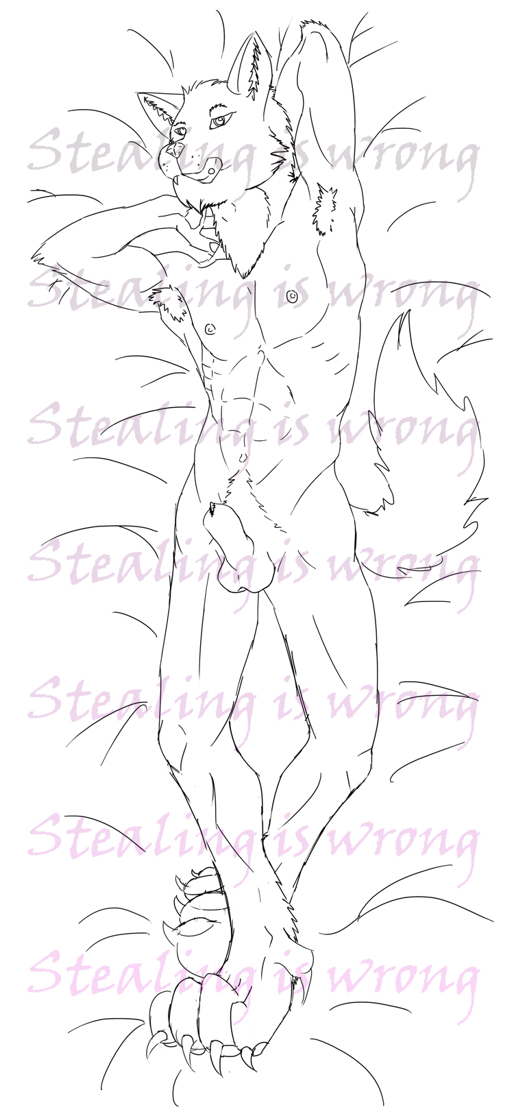
2013-10-23 [pegasus1000]: not exactly my type of nudity... I would say more about artistic nudity vs phallic art and where this would lie (with it being a hard on) but I will digress. :)
2013-10-26 [Aeolynn]: actually it's not really a hard on- yet. That is the natural sheath
| Show these comments on your site |
|
Elftown - Wiki, forums, community and friendship.
|